Pocket Store
Hyperlocal Ecommerce Platform
An interactive platform, that aids the effortless offline-to-online migration for online grocery stores from scratch.
- Role
- Lead Product Engineer
- Location
- Remote + Occasional Onsite
- Year
- 2020
- Website
- Play Store
Introduction
Pocketstore is an ecommerce store developed during the Covid-19 pandemic to enable stores to sell grocery products directly to consumers, eliminating the need for intermediaries such as Instacart, Grophers, Jio Mart and others.
In 2020, the project was launched during the middle of the pandemic and helped our client increase their sales up to 225% compared to their previous sales without an online sales channel. We interacted directly with the client and customers to gather feedback on the product and implemented numerous features that were deemed appropriate.
Challenge
Managing inventory in both the customer billing software and the e-commerce store posed one of the most significant challenges during the project. Our primary concern was to ensure that the stock was kept up-to-date to prevent instances where a customer orders a product that had already been purchased by another customer.
Following the proposal of the project, we conducted research on the client's existing customer base. The findings revealed that more than 50% of the customers were over the age of 40, hence we had to incorporate design patterns that were familiar to them.
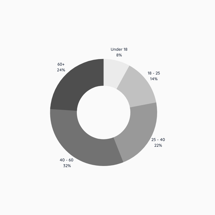
Fig: Customer Demographic for offline customers
We were faced with another challenge, which involved obtaining direct feedback from customers. This task was difficult since many individuals were reluctant to meet for what they considered to be trivial.
Goal
At the beginning of the project, we established clear objectives to prevent the need for revisiting various ideas. These objectives included:
- Creating a design pattern that is similar to the ones used in other products that are familiar to the target demographic (e.g., Amazon, Flipkart).
- Directly linking the inventory with the store's existing billing software.
- Developing a simple yet comprehensive dashboard to manage the ecommerce portion of the project.
- Allowing only contactless payment methods for checkout in the application.
Role
I had the distinct pleasure to work with Mr. Amal John in this project. We subdivided the project on the basis of our strengths and I had to:
- Designing a comprehensive e-commerce system for grocery products.
- Creating reusable components based on the design for easier testing.
- Starting a new Nuxt.js Isomorphic project with Express.js as the backend.
- Developing a REST API based backend that could be easily consumed by the front-end.
- Implementing an authentication system using `jsonwebtoken`.
- Writing controllers in Node using Express.js.
Meanwhile, Mr. Amal was responsible for:
- Providing guidance and leadership to the project.
- Creating devops scripts for automatic deployment from GitHub.
- Hosting the project on Digital Ocean for production and Heroku for staging.
- Designing and implementing the database schemas for the project.
- Writing commit-based hooks to prevent commits that do not adhere to high-quality code.
First Release
Once the initial version of the application was completed, the client requested that we make the application multi-vendor to allow for the addition of other stores without affecting the old system. We made the necessary changes to the application to enable this while keeping the old version functional until all old customers had updated to the new system.
As a result of this change, the application was able to support a variety of different stores, including restaurants, bakeries, fish markets, and meat markets. To reflect this diversity, we also designed the consumer-facing app to include distinctive features tailored to the needs of each type of customer.
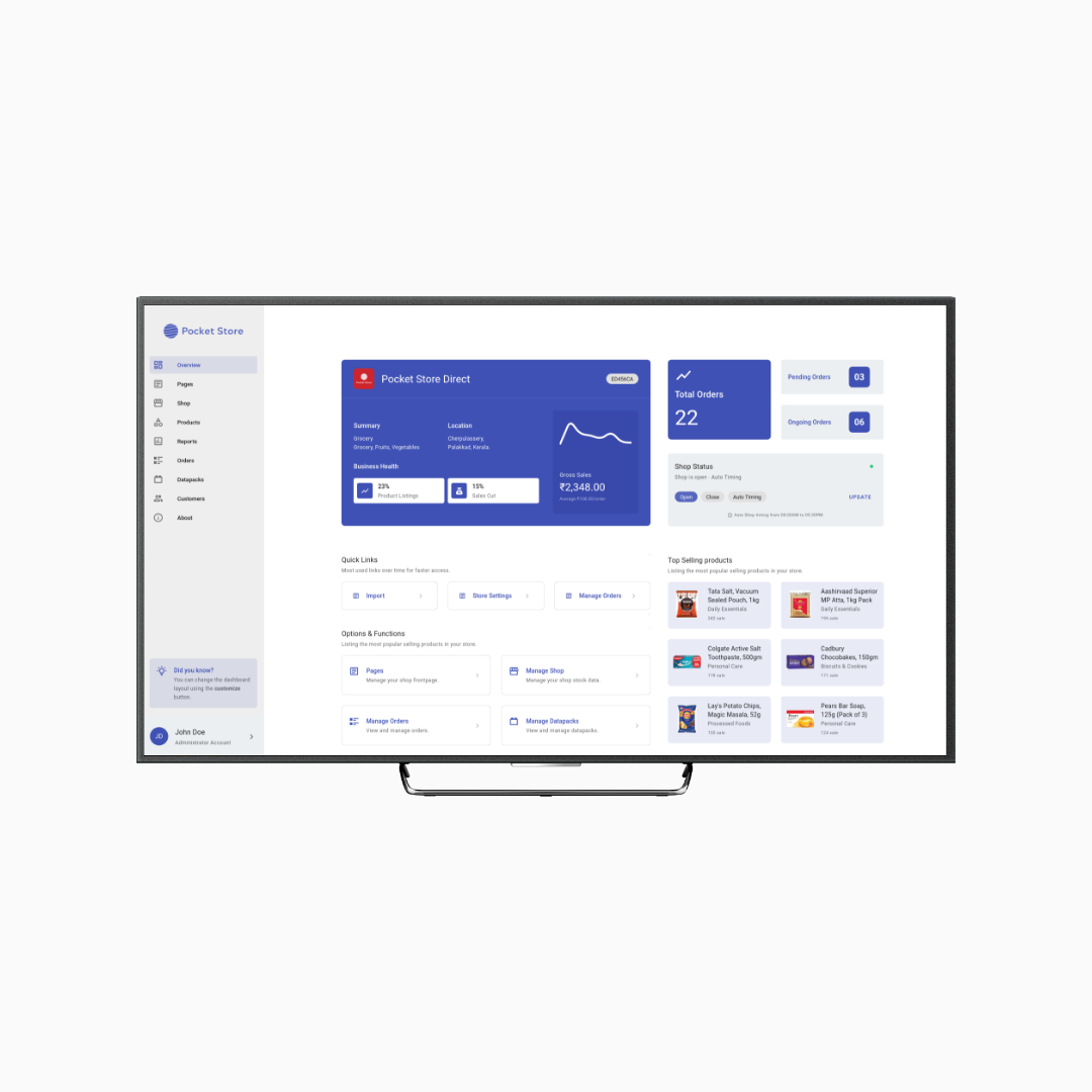
Fig: Administration Dashboard for Client
Conclusion
After the release of the product, our team began working on improvements to the application based on feedback from both the consumer and the client. We decided to add a feedback form within the application for ease of use and placed a link directly below the successful checkout notice. This allowed us to gather suggestions and critiques from customers more directly and efficiently.
We received a wide range of feedback from customers including recommendations for improving the delivery process from the client's end, as well as addressing text size issues on specific devices. By listening to and addressing these concerns, we were able to make specific improvements to the application to enhance the overall user experience.
Being involved in the project and close to the actual delivery process was a great experience for our team. We were able to work closely with the client and delivery personnel to tailor the application to meet their specific needs, which was incredibly rewarding for us. Overall, we were happy to be a part of this project and help make a positive impact on the client's business.
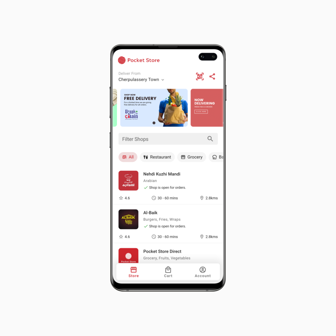
Fig: Revised Homescreen for consumer application
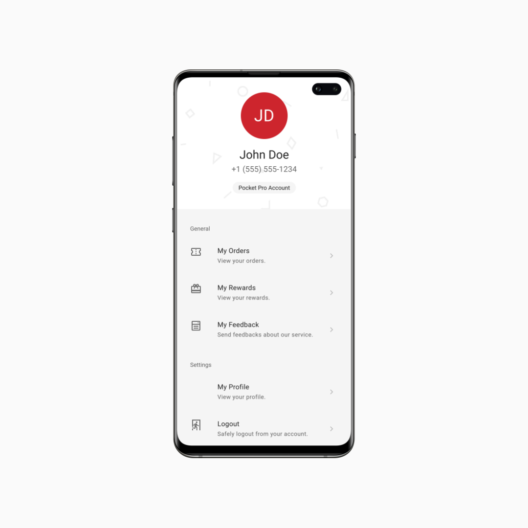
Fig: Account Tab Section for consumer application
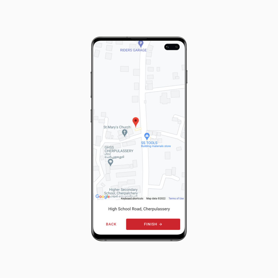
Fig: Location Picker during order for consumer application